


Comments (72)
 PRO
PROPatricia Colwell Consulting
11 days agoWhat exactly are yu wanting help with. I see many things I do not like but that is a personal preference The counter and backsplash do not work together . I like all LED 4000K lighting in a kitchen it mimics bright daylight and keeps all colors true all the time. I dislike wood hoods they get greasy and also change color over time from stam and grease . I think passing a range when going fron fridge to sink is bad design but unless you are now wanting to do a major change I would do anew backsplash and move on
Kathy thanked Patricia Colwell Consulting
Kay p
11 days agoIt’s just your backsplash. I really like everything else. I am not sure but could you just paint backsplash? It seems like the simplest solution. Patricia is that a solution?

dani_m08
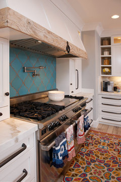
11 days agolast modified: 11 days agoIs your backsplash Bedrosian Cloe white OR is it Floor & Decor’s similar tile to Cloe white?
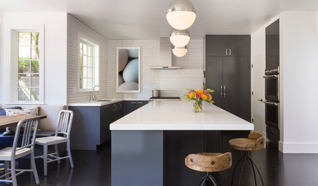
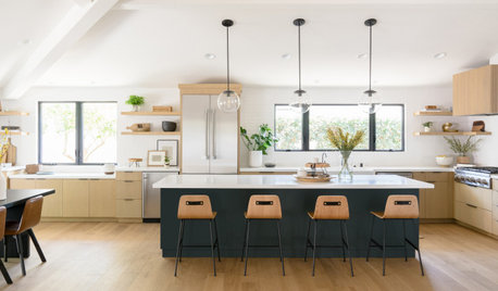
I think it was a mistake by your designer to (i) select a backsplash that has a v4 variation (highest) between tiles, (ii) mixes cooler shades of gray with white tiles, and (iii) use a herringbone pattern when your countertops have bold veining = should be the ”star” of the kitchen.
If I paid a designer to design my kitchen - I would not expect to have competing cool and warm tones OR a busy countertop + a busy backsplash (v4) installed in a busy pattern.
I would show my designer all of these comments - and ask her how she plans to remedy the issue.
You could try changing the lightening to all cooler lights first to see if that has enough impact - that way you can show her that you’ve tried to find a solution based upon some of the comments. However, I do not think that it will fix the issue.
I would NOT paint my brand new cabinets!!! A factory finish is much more durable + professional cabinet painting is expensive. I also would NOT paint my backsplash tile.
I can only imagine how disappointed you are after spending $$$ and time on this project - and not being happy with the result. The difference between your post and many other similar posts is that you PAID a professional - and did not mistakenly select your backsplash tile assuming that it would work.
Bedrosian Cloe White tile is a very popular tile (was sold out for many months a couple years ago because so many people used it for their kitchens (some bathrooms - I used it in one of my guest bathrooms).
Your ”Cloe” tile (or F & D similar tile) appears to have even more variation in the photo than it does in most of the backsplashes posted on Houzz (there are two very long posts that have photos of many kitchens with Cloe - including some w/ the F&D version).
I have noticed that the lightening seems to make a difference - and that the more natural lighting in the room = makes the variation more subtle. Please find out if it is Cloe or from F&D - and let me know. While they are close, I don’t think they are exactly the same.
Makes me wonder if you were shown Cloe but have the F&D tile (which was more expensive than Cloe based upon posts - until the price for Cloe was increased quite a bit - although I think it’s gone back down a bit),
Also, in order to understand how Cloe will look, your designer should have shown you many tiles - not just 2-3 sample tiles. You cannot tell how much variation it has unless you see a bunch of tiles next to each other. If you were shown only a few tiles, you may have seen one of the shades that looked like it might have worked (I believe there are 8+ shades in Cloe - and maybe more in the F&D version - both tiles are glazed and made in Spain).
 PRO
PRODiana Bier Interiors, LLC
11 days agoThank you, Jennifer, for pointing out that changing the lighting is not going to solve the problem.
I like Red Ryder's options for a new, warmer white backsplash.
And your designer made the mistake, not you.
Kathy Holguin
11 days agoThanks all of you for your suggestions. i appreciate them all. Fyi the designer was in the room and the countertops and cabinets were installed already when she suggested that distracting backsplash. i should have not rushed into that decision and i have learned a valuable lesson.
- PRO
Diana Bier Interiors, LLC
11 days agoIf I made that suggestion to one of my clients, and it turned out like that, I would be very upset. I'd try to do anything I could to fix it. You shouldn't have to take any responsibility for it, unless you made this decision against her recommendation.
eld6161
11 days agoYou should be refunded the cost of the backsplash as that is a do over. Show this thread to her!
You don’t want to name names, but ……leave it as a cliff hanger.
Many of us here have had to replace brand new backsplashes because for whatever the reason, they just didn’t work.
In your case, it’s the white tiles and white in the counter that clash. So, counter should have been warmer .
The designer matched the counter and tile without taking the warmth of the warmth of the cabinets.
Did she pick the counter too? I know you said it was there already.
Things seem okay in the first picture. Try first what Artist is showing you about lighting.
Paul F.
11 days agoThe photos the OP has supplied show one with what appears to be the wrong color temperature lighting the tile. The pics shows something across the room bathing the kitchen in a strong blue and purple light reflecting off the tile. I'm not sure how anyone can recommend extreme measures at this point if we can't see the true colors.
I adjusted lighting temperature below... I did nothing to the color of the front of the cabinets or the drawers.
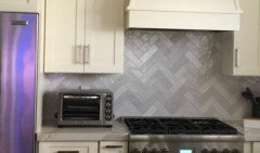
Warmed the shelf lighting
Cooled the interior cabinet lighting. Kathy thanked Paul F.
Kathy
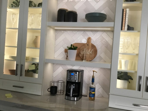
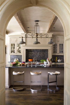
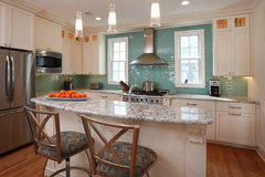
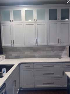
Original Author11 days agoMy inital pictures above the stove where of natural light shining in from the window. the picture of the lighted cabinet are with the LED strip lighting on. Both the interior cabinet and the strip under the shelves is the same however to me with the current backsplash the backsplash reads cooler than the interior cabinet. If i want to change the backsplash to work with the counters and cabinets should i adjust the recessed lighting overhead to be warmer or cooler. my husband changed the setting on the recessed lighting to a lower setting and i think i helps bring out the warmth of the counters. Thinking about it i dont believe the designer suggested i view the tile in different types of light. FYI the tile is FD zellige pearl opal not either of the ones the other people have suggested.
Kathy
Original Author11 days agoMy mistake for rushing to pick the tile. i have learned a valuable lesson, to slow down and take my time. this is why i am reaching out to this forum to help me make a more informed decision in the future. once again i appreciate everyone who has offered advice.
Mrs Pete
11 days agoI agree that the backsplash doesn't match everything else, but I'll also say:
- The wall with the range hood seems rather busy.
- I dislike the counter tops, but that's personal opinion.
- PRO
Diana Bier Interiors, LLC
11 days agoNo matter what it looks like on a computer screen, the ONLY way to tell if it works is with your own eyes, in your room, with your light. The OP says it is off, so we need to take her word for it and offer suggestions. Color correcting on the screen is a nice touch, but we don't know if any of the suggestions will work IRL.
You can adjust the light to what you prefer, and then view tile samples in person to see if they work with your lighting, cabinets and counter top material.
Keep in mind that it is difficult to blend three different white/neutrals. They all have an underlying hue which can lead to them not working well with each other.
One way around that is to select (in this case) a tile that is a large contrast in color or value to the other two. What colors do you like? Red/purple/blue/green/yellow/orange? You could also use a dark brown or black. What's in the rest of your house? If you like blue, then select a dark or saturated or muted blue. Something that contrasts with both your cabinets and counter top. Not only is this easier to accomplish, but it makes the room more interesting and dramatic.
Look at these kitchens for some examples:
Yellow with a black liner:
 Sierra Street · More Info
Green:
 Zinc Extractor in Villa Kitchen · More Info
Iridescent black:
 2009 Southern Accents Showhome · More Info
Turquoise arabesque:
 Mediterranean Kitchen · More Info
More green:
 Horse Farm in Upstate New York · More Info
 eco+historical Downey · More Info
Aqua glass:
 Cabinets, Kitchens and Bathrooms · More Info
Navy blue/black fishtail:
 Concord Avenue · More Info
Medium gray:
 East Harriet Colonial · More Info
More green:
 Interior Portfolio · More Info
Red/white checkerboard is fun!
 Berkshire Country · More Info
 Paul F.
11 days agolast modified: 10 days agoThis forum is loaded with "I've made a mistake" posts and 'it seems off' and 50%+ are just the stress of all the construction choices and not wanting to make a mistake.
Here is the same backsplash on F&D website.

Maybe the key is embracing blue, the complimentary color to yellow... instead of trying to warm everything up?
jo mu
10 days agoI agree with the ppl saying that the lighting can't solve this
I suspected one of your pictures is of natural daylight coming in and the warm cool contrast is quite visible and your posting here for a reason you must see it too
Someone said 4000k for light but that is way too cool for interiors do not go above 3000k it'll look like hospital lighting otherwise ( I personally prefer 2700k but with higher lumens)
Keeping back splash simple is always better than not. There are beautiful applications of unique backsplashes but it's actually quite hard to pull off
Keep us posted
Paul F.
10 days agolast modified: 10 days ago
Lots of unnatural color coming in because of blue curtains or something outside. Looks like a big TV reflection to me. Photoshop is telling me there is heavy blue and purple just in the area. PRO
PROJAN MOYER
10 days agolast modified: 10 days ago
I'm sort of sick to death of the temperature of lighting issue. I will set aside my pure loathing of 4000k anywhere - it's personal.The real issue is color selections and marriages don't lie, and this designer sucks rocks for a number of reasons.
When someone is attempting a foot in two boats....and in this case the glam modern effect of Warm Britannica, with the island in wood, very traditional cabinetry/hood stye ? I stomp a foot and that ISN'T the the top selection. Big fat NO. "Lets keep looking, shall we?" "It's too much glam and modern for all else you've told me you wanted"
Which is.......
"i would like to achieve a modern warm transitional maybe farmhouse design. The family room is Sw white Duck and the trim is BM white dove. The floors are white oak"
Yes, I agree the backsplash is a big issue, getting the ice cold gray out of there will help immensely. But not going to lie . I hate this particular quartz in this kitchen, ( will add that that does not encompass every quartz), but the marriage is not made in heaven , here.
Warm it up. Get to one 3500 at most temperature everywhere in that kitchen.

I think If I read another of these huge disappointments, I will set my hair on fire.I
Andee
10 days agoI don’t think the manufacture’s picture of the opal pearl tile in that warm white kitchen looks right either! The blue helps, but barely. The words “opal” and “pearl” do not bring to mind the words “warm white”.
dani_m08
10 days agoKathy - your backsplash tiles are one of the ones I asked about - the Floor & Decor Zellige tile that is similar to Bedrosian Cloe.
I think Jan is right (as usual - 😂) - the quartz is very modern looking - but the cabinet style + wood island aren’t. I also do not like 4000k lighting - feel like I’m in a hospital or something.
If your designer had looked at the projects posted by real people on F&D’s website, the gray/cool tone would have been obvious + she should have known that it’s a very busy looking tile (more so than Cloe) - has some very white tiles and some very dark tiles (and everything in between):
I’ve actually seen a shower with this tile in person - and this photo on F&D’s website is exactly how that shower looked to me IRL:
OR if she would have gone into F&D and saw the display - here are some photos posted by other Houzz users who went and looked at the F&D tile when Cloe was backordered everywhere:
The paint sample shown against the display below is SW Pure White:
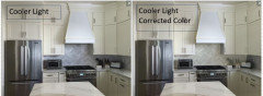
However - the lighting will affect how cool the tile looks - and warmer lighting will make the tile look less cool toned:
The next two photos are of the same kitchen with the same tile as OP - with different lighting:
I would listen to Jan and ”warm it up” - and let your designer know how disappointed you are. You should be excited about having a new kitchen - not be on Houzz because you’re upset. Makes me sad.
So Sorry that your designer didn’t have the skills/expertise/eyes to correctly design this kitchen for you.Kendrah
10 days agoThis is not a matter of rushing to a decision. Give yourself a break. You paid a designer for their experitise. You’d expect them to give you choices that work, and that it should be fine for you select an option quickly. In fact,
most designers like a decisive client. However, the designer made a big, costly rookie mistake. Not your fault!
Kathy thanked Kendrahrockybird
10 days agoCan you post more photos? Maybe at a different time of day and with the lighting on?
Kathy Holguin
10 days agoRockbird, i will take more photos after work today. FYI changing the color temperature to 2700 made a difference. counters looks warmer and the cabinets do not seem so yellow. to make this kitchen the best it can be besides a new backsplash should i repaint the island to match the ither cabinets and remove the wood around range hood. i believe there is a stainless steel hood under that wood

Hillary Moers
10 days agoI would paint the wood cabinet ( island) Benjamin Moore revere pewter. That would make the rest of the room cohesive. I do t think there is ANYTHING wrong with the back splash. The wood cabinet is the problem. You can change the lighting bulbs if you want. It may give the room an all over glow.
rockybird
10 days agoI think we should see more photos before deciding on the island, hood, etc. But from the photos that you posted, I might want to paint the island. I feel that the designer picked that backsplash for a reason and before we throw her under the bus, we should see more than three photos. I also think that the backsplash looks good with the cabinets in the close up photo with the shelving. Often when I take photos, I cant get the photo to relay the colors I am seeing, so its possible that is what is going on here. Or the lighting is off. Or maybe the backsplash truly doesnt work. I don’t think we have enough evidence to make a call yet.
Paul F.
10 days agolast modified: 10 days agoWhat about cooling the paint job on the hood so the backsplash seems more intentional.

- PRO
Diana Bier Interiors, LLC
10 days agoAbsolutely no to painting the hood a different color.
And no to painting the island.
It's a matter of the backsplash. It's not brain surgery--replace it with a warm neutral or a totally contrasting color. Get the designer on board and tell her why you're unhappy. Try samples until you get the look you want.
Doesn't matter what it looks like in the F&D website--how it looks in YOUR room with YOUR light is the only thing that matters.
Kathy Holguin
9 days agoThe above three photos are in the afternoon light though the kitchen windows.
Kathy Holguin
9 days agoThe bottom two photos are with the recessed lighting at 3000. the last photo is the dimmer switch as low as it can go. i dont know the color temperature , both the under cabinet LED strip and interior LED strip are on a dimmer. i have decided the backsplash is definitely going away. i want a peaceful place and that backsplash is too busy. i need a backsplash that blends in and doesnt stress me out. i agree with the comment above that its too cool and distracting for the space ( the pattern, the colors , EVERYTHING!
- PRO
JAN MOYER
9 days agolast modified: 9 days agoOH!!!!!!! I DIDN'T REALIZE ! Oh woe is me!!
It's around the window! No matter what you select? Do not repeat that! and have her make you a finish trimmed panel at the bar.
It needs no tile!!!
Kathy Holguin
9 days agoSo let me try to understand you Jan. Have the cabinet people make me a panel for the back of the bar cabinet and when i redo the backsplash do not take it to the ceiling where the kitchen sink is. i had already decided that i didnt like that. so thanks for telling me that is a mistake. That was another suggestion the designer had. i hate that too.

Kathy Holguin
9 days agolast modified: 9 days agoso Jan you are suggesting tiling under the window and up to the same distance as the tile under the cabinets on the left
- PRO
JAN MOYER
9 days agolast modified: 9 days agoYes, I am suggesting just that!
Look...... I think what has happened recently is people forget what a splash is for. Call it tile obsession to the max.
Your counter isn't busy, but it isn't subtle either! It was your "star" ......then it got completely upstaged by the under study.
Actually? It may be even better to just add another cabinet at the bar fridge.
Why? This gal did not help you clarify your look. At all.
I am sorely tempted to tell you get more of the counter, run it up the splash . All of it.
This would have been a SENSATIONAL kitchen with a soapstone counter, or TaJ Mahal, the wood island and even repeat the wood at the bar area in cabinetry......
The lighting is making me crazy. From cold shower to the hot tub ? : )

HU-187528210
9 days agoStart with the lighting. It’s a beyond beautiful kitchen. I love the island and cabinet colors. 🤎🤍
Paul F.
9 days agolast modified: 9 days agoOk, so now we can see that lighting was the issue after all. If you had posted this picture to begin with no one would have said anything negative. Now, I see the weird blue light on the tile was coming from the beverage refrigerator across the room.
I think it looks nice, but if you don't like it at this point thats what matters. Not sure how much blame the designer should get since this looks to be a successful kitchen design... tiled wall and all. In my opinion, there is no reason to redo this kitchen other than you don't like it. Good luck!
 Kathy thanked Paul F.
Jennifer Hogan
9 days agoThere is no right or wrong when it comes to the temperature light you like in your home.
In the morning and evening natural daylight light is warmer than at noon. The colors in my landscape look different at different times of the day, but not more or less beautiful.
If I wear a red shirt it will look good on me if I go out in the morning, afternoon or evening.If I wear an olive green shirt it will look awful on me in the morning, afternoon or evening.
Lighting does not fix colors that clash - olive green clashes with the pink undertones in my skin. I can't make it work.
The same goes for inside your home. Two colors that clash will clash with cool or warm light.
I played with the OPs picture to show what happens when we change lighting and what happens if we change the offending backsplash color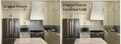

No matter how I change the lighting the color of the backsplash clashes with the color of the cabinets.
When you fix the color of the backsplash it goes with the cabinets no matter how you change the lighting.
Lighting needs to work with your home. A colonial home with antique furniture will look off if you use lighting that is too cool. A modern black and white aesthetic will look off if you use lighting that is too warm.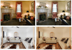
- PRO
Diana Bier Interiors, LLC
9 days agoWow, Jennifer, you really hit the nail on the head.
As opposed to what some pros always say, no one lighting situation is best for every home and every homeowner.
And just to reiterate what I always say: YOU CAN'T DETERMINE TRUE COLORS FROM A COMPUTER MONITOR!!! You have to see the room in real life, at different times of the day/evening to perceive color.
- PRO
JAN MOYER
9 days ago"No matter how I change the lighting the color of the backsplash clashes with the color of the cabinets."
Yup!!
Jennifer Hogan
9 days agoYOU CAN'T DETERMINE TRUE COLORS FROM A COMPUTER MONITOR!!! You have to see the room in real life, at different times of the day/evening to perceive color.
This is so frustrating!It isn't just the monitors - I have a really high quality monitor that has excellent color capabilities and is quite accurate. Spent a pretty penny getting something that works the way I want it to work. I still can't share a picture with accurate color.
My cell phone auto corrects colors. My computer optimizes the colors when it translates the color space from the space used by my phone to the space used by my computer.
The picture below is a picture of my freshly painted foyer. The color I picked was Benjamin Moore Frosted Toffee. The color swatch from the BM Site is in the middle of the wall.
I do not have a gray foyer. It truly is a light taupe that borders on pink beige.The floor is purple red and green slate. Much more colorful than it looks on the screen and the brick is also more colorful. Same brick as my exterior.

- PRO
JAN MOYER
9 days agoMy I phone 13 takes hideous pictures. My Plus 6 I stilllll miss. My I pad ( the old one ) took fantastic pics.
I don't want "live", I want fewer bells and whistles, I just I want true color .
My desk top Mac is super accurate color. Almost flawlessly so

deegw
9 days agolast modified: 9 days ago@Kathy Holguin , your first post mentioned changing the cabinet color and then everyone chimed in about the backsplash.
Do you still think the cabinet color is the issue? Do you think it is the backsplash? Or something else?
What does the designer say about your concerns?
eld6161
9 days agoWhile I get the importance of lighting and how it can help correct a situation, you are not going to have lights on 24/7. There are times when you just use the natural light.
The problem is the white tiles. If you would have chosen a warmer gray solid and not the mixture, it would have been fine.
I agree that you don't need the tile up and around the window in your particular scenario.
Paul F.
9 days agoQuestion is would anyone have said to redo this kitchen had this been the first picture?

- PRO
JAN MOYER
9 days agolast modified: 9 days agoIts more than does it ”go ”
It upstages the counter, she finds it busy and not peaceful, and doesn’t like it
Sadly? There is way too much of it in the kitchen…..
Kathy Holguin
8 days agoTried to reach to the designer and have not heard back as of yet. Like Jan said earlier the backsplash may work to some of you but i cant stand it. i have tried to live with it for a month now and it has not grown on me though changing the color temperature overhead has helped. i will take the advice of many of you and replace the backsplash with a warm white. Last night i even floated the idea of buying more Britannicia warm to my husband. He is not on board with that idea (yet)
Kathy Holguin
8 days agoi truly appreciate all your help. You are all awesome. For now i am going to wait to hear from the designer and see what she will do to help me feel good about this remodel.
- PRO
Diana Bier Interiors, LLC
8 days agoIf you decide on tiles for the backsplash use a simpler pattern, like a square or rectangular tile in a running bond pattern. No herringbone or variegated colors, since that seems to be what you dislike about this one.
rockybird
8 days agoI think it matches better on the new photos, but I agree with you that it is too busy. Let us know what your designer says.

Boxerpal
8 days agoKathy,
Go with your instinct you know what you like. Soothing, warm and handsome. This backsplash is not for you. Very beautiful but it's not for you. The right one will come along. Gosh, I sound like I am giving advice to a young woman concerning the right boyfriend. Same advice, the right one will come along and when it does you will know. A spark, a wink, a perfect smile and it will win your heart.
Wishing you joy as you find the perfect fit in your new backsplash.


kempek01