


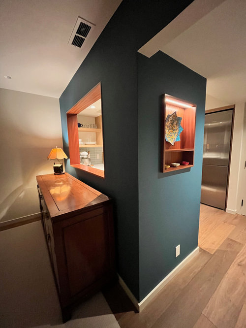
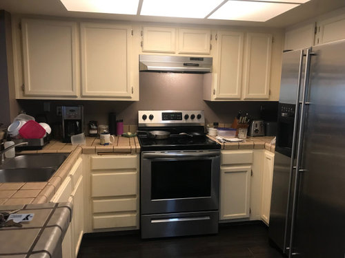
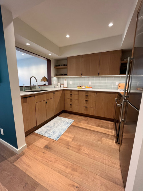
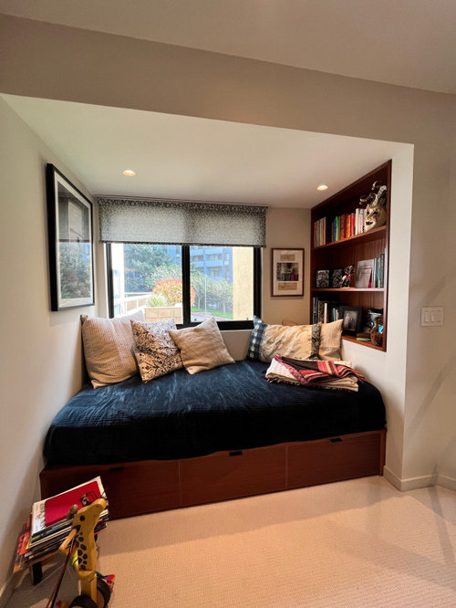
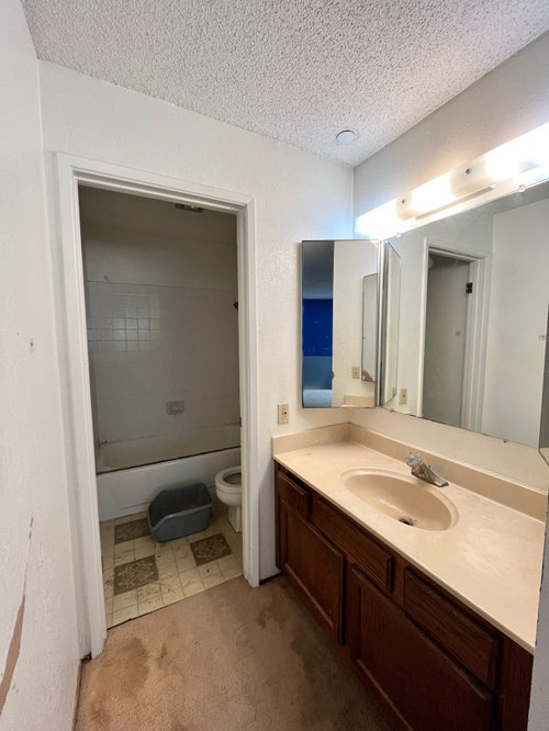
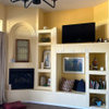
Before and after condo remodel
Lynn Eve Komaromi
10 months ago


Featured Answer
Sort by:Oldest
Comments (41)

cpartist
10 months ago
Lynn Eve Komaromi
10 months agoRelated Professionals
Federal Heights Kitchen & Bathroom Designers · Glens Falls Kitchen & Bathroom Designers · South Farmingdale Kitchen & Bathroom Designers · Chandler Kitchen & Bathroom Remodelers · Garden Grove Kitchen & Bathroom Remodelers · Lakewood Glass & Shower Door Dealers · Waco Glass & Shower Door Dealers · Littleton Window Treatments · Bloomington Kitchen & Bathroom Designers · Waianae Kitchen & Bathroom Designers · Sunrise Manor Kitchen & Bathroom Remodelers · Port Orange Kitchen & Bathroom Remodelers · South Lake Tahoe Kitchen & Bathroom Remodelers · South Plainfield Kitchen & Bathroom Remodelers · Upper Saint Clair Kitchen & Bathroom Remodelers
darbuka
10 months agojackowskib
10 months ago
rebunky
10 months agomxk3 z5b_MI
10 months ago
Rho Dodendron
10 months ago
Lynn Eve K
10 months agocourse411
10 months ago
RedRyder
10 months agotheresa21
10 months agoLynn Eve K
10 months ago
acm
10 months ago
Karenseb
10 months ago
Rosie G
10 months ago PRO
PROOTM Designs & Remodeling Inc.
9 months agojakkom
9 months ago
thinkdesignlive
9 months ago
Ellen-Fay Simmons
9 months ago
Kay p
9 months agoLynn Eve Komaromi
9 months agolast modified: 9 months agoLynn Eve Komaromi
9 months agoLynn Eve K
9 months ago PRO
PROJoseph Corlett, LLC
9 months agoanna_682
9 months ago
Priya S
8 months ago
vicbayside
8 months ago- PRO
OTM Designs & Remodeling Inc.
8 months ago  PRO
PROPRM Custom Builders
8 months ago PRO
PROCelery. Visualization, Rendering images
8 months ago PRO
PROMay Construction, Inc.
8 months ago
zealart
8 months ago PRO
PRONorwood Architects
8 months agoLynn Eve K
8 months agoJj J
8 months ago- PRO
Norwood Architects
8 months ago

Related Stories
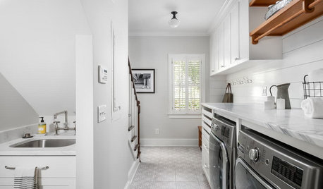
LAUNDRY ROOMSBefore and After: Remodeled Laundry Room Lightens Up
See how shiplap walls, marble countertops and a new glass door brighten this laundry-mudroom combo in Atlanta
Full Story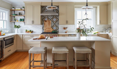
KITCHEN MAKEOVERSBefore and After: 3 Remodeled Kitchens With a Vintage Vibe
A hand-painted hood, a brick fireplace and patterned porcelain tiles add classic charm to these renovated kitchens
Full Story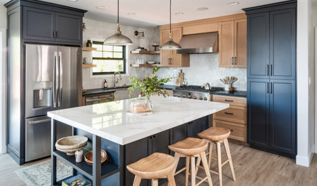
KITCHEN MAKEOVERSBefore and After: 5 Kitchen Remodels Under 160 Square Feet
New layouts and lighter palettes help these smaller-than-average kitchens feel more open and bright
Full Story
BATHROOM MAKEOVERSBefore and After: 3 Bathroom Remodels With Vintage Vibes
See how designers expertly blend modern amenities and classic style in these bathrooms
Full Story
KITCHEN MAKEOVERSBefore and After: 3 Kitchen Remodels That Kept the Same Footprint
See how pros transformed these kitchens without changing their sizes or layouts
Full StoryBEFORE AND AFTERSBefore and After: See a Complete Kitchen Remodel for $35,000
An expanded layout, new maple cabinets and granite countertops breathe new life into this family gathering space
Full Story
BATHROOM MAKEOVERSBefore and After: 4 Bathroom Remodels in 91 to 102 Square Feet
Browse bathrooms with styles inspired by Tudor homes, inns, five-star hotels and spas
Full StoryBATHROOM MAKEOVERSBefore and After: 5 Bathroom Remodels That Free the Tub
Replacing bulky built-in tubs with streamlined freestanding ones rejuvenates these bathrooms
Full StoryKITCHEN MAKEOVERSBefore and After: 3 Kitchen Remodels in 185 Square Feet or Less
Refaced cabinets, clever storage and better layouts make these kitchens feel bigger, brighter and more functional
Full Story
KITCHEN MAKEOVERSBefore and After: 3 Kitchen Remodels With Stylish Breakfast Nooks
See how designers added breakfast nooks to these kitchen makeovers to provide more seating and storage
Full Story


blfenton